User Guide — IHTML (Interactive HTML)
Everything the editor does: interface, vectors, artboards, timeline, actions, physics, export and import, keyboard shortcuts, and the public API.
1. Getting started
-
Download and install IHTML (Windows, macOS, Linux, or
Android), or clone the repo and run
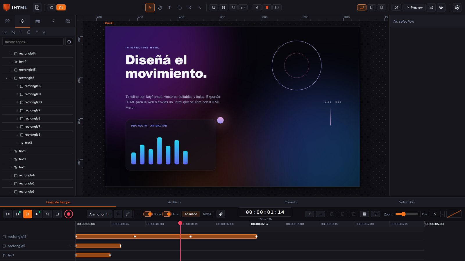
npm installandnpm run dev. - The central canvas is your scene (one or more artboards, see below). The top bar has the selection/creation tools; the left sidebar shows your Layers; the right one is the Inspector for the selected element's properties; the Timeline is at the bottom.
Language and theme
Top right, next to the canvas tools, there are two selectors:
- Language — 8 available (English, Español, Português, Français, Deutsch, Italiano, 日本語, 中文): translates all main navigation and the whole Inspector (Design/Data/Actions/Physics).
- Theme — six themes, light and dark (dark gray by default).
Both are remembered between sessions (they live in your browser) and are an editor preference
— never saved inside the .ihtml project or reflected in the exported HTML.
Creating an element
Use the tools in the top bar (or the Elements panel on the left) to add text, shapes, buttons, inputs, cards, navbars, and other ready-made components. The new element appears selected, with its bounding box visible.
The top toolbar tools
| Tool | What it does |
|---|---|
| Select (V) | Select, drag; dragging over the background draws a multi-select marquee. |
| Shape (S) | Drag to draw a vector rectangle; hold Alt for an ellipse. |
| Text (T) | One click creates a text element at that point. |
| Zoom (Z) | Click to zoom in, Alt+click to zoom out. |
| Hand (H) | Pan without having to hold the space bar. |
| Pen (P) | Draw a path by hand (see below). |
Shape and Text switch back to Select on their own after creating one, so the next click doesn't accidentally create another element.
Vectors (drawn shapes)
Shapes from the Shape tool — and the cards in the Shapes category of the Elements panel
(Rectangle, Ellipse, Triangle, Polygon, Star, Spiral) — are real vector elements:
they're exported as an <svg> with a real <path>, not as a div
with rounded corners. Triangle/Polygon start out as regular polygons (3 and 6 sides), Star as a
5-point star, Spiral as an open spiral. The number of sides/points is fixed when created; for a
different shape, adjust the nodes by hand.
-
Fill, Stroke, and Stroke width are edited in Element Properties, inside
the Inspector's Data tab (they accept
noneto remove the fill or stroke) — not in the Design tab's Fill/Background section, which doesn't even appear for a vector: that section paints the background of the box wrapping the drawing, not the<path>itself. -
Fill and Stroke come with a color swatch next to the field. The text field still drives it (you
can still type
noneto remove the fill). -
Numeric fields (Stroke width, a slider's min/max, a Canvas buffer...) can be dragged to
change the value (⇄ icon next to the field):
Shiftfor finer steps,Altfor coarser ones. -
Resizing the element scales the drawing: the geometry lives in its own space and the
viewBoxstretches it to the box. - The ellipse is stored as four real bezier segments, not as a CSS circle.
-
Clip children to shape (Data > Element Properties): elements nested inside this
vector become invisible outside the polygon's area — a pure-CSS clip mask using
clip-path. It only has an effect if the vector has children. - Animate points (◆ button at the end of its properties): a vector can animate its whole shape with keyframes. Tap the button at different points on the Timeline after editing nodes and that shape gets recorded as a keyframe; the editor interpolates each node separately (smooth morphing). It only interpolates well between two shapes with the same number of nodes.
The Pen tool (drawing a path)
- Each click on the canvas adds a straight vertex (corner).
- Click and drag gives that vertex symmetric bezier handles — the classic gesture for a "smooth" node.
- Enter closes the path as open (a line).
- A click near the first vertex closes it as a polygon.
- Escape discards the whole drawing — no element gets created.
When you finish, the path goes straight into node-editing mode.
Editing an existing vector's nodes
Double-click on any vector element to enter editing mode: a draggable white point per node and a blue point per bezier handle.
- Dragging a node (white) moves it — the whole curve moves with it.
- Dragging a handle (blue) changes only that curve.
- Delete removes the selected node (never below what a valid path needs: 2 nodes open, 3 closed).
- Escape exits editing mode and goes back to the normal handles.
Move, resize, rotate
- Drag to move, or use the arrow keys (Shift + arrow = 10px). With several selected, the whole group moves together.
- Bounding-box handles to resize: Shift keeps proportions, Alt resizes from the center, Ctrl snaps to the grid.
- The circular handle rotates the element.
- An element nested inside a rotated/scaled parent follows the mouse or the arrow keys along its own visual axis, not the screen's axis.
-
Smart snapping: it snaps on its own to the edge/center of nearby elements or manual guides,
with a pink/cyan line while the snap holds.
Ctrlforces grid snapping instead (mutually exclusive). - Ruler and guides: dragging from the gray bar above or to the left of the canvas creates a manual guide (cyan line). Double-click removes it; dragging repositions it.
Artboards (multiple work surfaces)
You can have more than one artboard on the same canvas, each with its own size and background. The "Add Artboard" button (or the background's context menu) creates a new one next to the active one.
- Clicking an artboard's background activates it (new elements go there).
- Dragging its label moves it; dragging its corner handle resizes it.
-
With arrow keys and nothing selected, the active artboard moves;
Deletewith no selection removes it (never the last one left). - Export HTML always exports only the active artboard, not the whole project.
Context menu (right-click)
One shared menu, with options depending on where you click: on an element (duplicate, delete, copy/paste, bring to front/send to back...), on the empty background (paste, select all, add artboard), on a specific artboard's background (rename, duplicate, delete that one), or on a card in the Elements panel (add it to the canvas).
- With 2+ selected: an alignment grid (left/center/right, top/middle/bottom) against the rectangle that wraps the whole selection.
- With 3+: also distribute spacing horizontally/vertically (the first and last stay fixed and the rest get spread with identical gaps).
-
With 2+ sibling vectors: a boolean operations grid (Union, Subtract, Intersect,
Exclude) using native SVG
fill-ruleandclip-path. The result renders exactly and animates/exports like any vector, but it doesn't stay as a single simple curve you can edit node by node.
The Inspector (right panel)
Four exclusive tabs — Design, Data, Actions, and Physics: only one shows at a time.
- Design — everything visual in one continuous scroll: Position/Size/Origin/Spacing, Flex/Grid Layout (appears when Display is set to Flex or Grid), Appearance (Fill, Opacity, Blend Mode, Border, Radius, Shadow), Typography (includes a web-font search, text color, text shadow), and Effects (scale, skew, 3D, CSS filters). Each section is an accordion that starts open only if it already has its own value. Also, Fill/Opacity/Blend Mode/Border/Radius/Shadow adapt to the element type: a vector doesn't show Fill/Border/Radius (those live in Data > Element Properties), a text doesn't show Border/Blend Mode, an image/video doesn't show Fill. If a section already has a real value, it still shows up — you never lose access to something in use.
- Data — HTML properties: Element Info (ID/Type/Name), the State selector (Normal/Hover/Active), CSS Classes, Element Properties, Custom Attributes, and Accessibility.
- Actions — no-code interactions (section 4).
- Physics — real simulation (section 4).
Display (Block/Flex/Grid) is chosen with 3 icon buttons; less common variants (Inline
Block/Flex/Grid, None) live in the "···" selector next to it. Flex/Grid Layout (Direction, Wrap,
Justify, Align, Align Self) and Stroke Style (Solid/Dashed/Dotted/Double) are also chosen with icon
buttons.
Grid's Columns/Rows are edited as a list of draggable tracks ("+ Track" adds, × removes;
minimum 1); values like auto or minmax(...) are edited as plain text.
A child of a Flex/Grid container genuinely respects the parent's layout and keeps its width/height
(it doesn't shrink silently).
Properties specific to the element type
In Data, below CSS Classes, Element Properties shows the selected type's real HTML properties. Examples:
| Element | Properties |
|---|---|
| Range Slider | Min, Max, Step, Value |
| Meter | Min, Max, Value, Low, High, Optimum |
| Progress | Value, Max |
| Inputs | Type, Name, Required, Disabled, Read only |
| Textarea | Name, Rows, Max length, Required, Disabled |
| Image / Picture | Source, Alt text, Fit, Loading |
| Video / Audio | Source, Controls, Autoplay, Loop, Muted, Poster |
| Link | URL, Target, Rel |
| iFrame and embeds | Source, Title, Loading |
| Details / Dialog | Open |
| Vector | Fill, Stroke, Stroke width, Clip children |
| Marquee | Direction, Behavior, Speed, Delay |
| Canvas | Buffer width, Buffer height |
The section doesn't show up for types with no properties of their own (Div, Text). Whatever isn't in
the list can still be edited with Custom Attributes (data-*, aria-*,
role, title...). A value equal to the default isn't saved and doesn't show
up in the exported HTML.
Importing a local file (Image/Picture/Video/Audio)
The Source field (and Poster on Video) comes with a Choose File button: the file
gets embedded as a real data: URI — portable between your machine and the web with no
dependency on external servers (the app has no backend). You can also paste with Ctrl+V an
image copied from the browser or file explorer: if you already have an Image/Picture/Video selected
it replaces it; if not, it creates a new Image. Pasting an element copied inside the editor still
works the same way (the editor checks first whether there's an image on the system clipboard).
Editable text on decorative components
Badge, Avatar, Tooltip, Alert Box, Tab Bar, and Breadcrumb edit their text with the
Content field (Design). Tab Bar and Breadcrumb use a comma-separated list —
Overview,Pricing,FAQ gives three tabs. Card, Pricing, Navbar, and Pagination still ship
with fixed sample content (they have more than one text of their own; a dedicated pass is still
pending). Tooltip is a static mockup for designing its look; for a real tooltip, pair it with
Actions (hover → Show / mouseLeave → Hide, with the Tooltip starting hidden).
Semantic containers (Header, Footer, Aside, Nav, Main...)
The Semantic category (Header, Nav, Main, Aside, Footer, Section, Article, Figure, Figcaption)
exports with its real HTML tag (<header>, <aside>...) — this
matters for SEO/accessibility. The five landmarks (Header/Nav/Main/Aside/Footer) start out occupying
a real edge of the artboard; they're just a starting point: edited like any other element, with no
color or border of their own.
Accessibility
Below Custom Attributes, the Accessibility section applies to any element: ARIA Label,
ARIA Role (with common roles and "(automatic)"), Hide from screen readers
(aria-hidden), and Keyboard focusable (tabindex="0"). All four come
out as real HTML attributes — on the canvas and in the exported file — without a single line of
JavaScript. For anything more specific (aria-describedby, aria-live...)
you still have Custom Attributes.
Fill: solid color, gradient, or image
The Fill field is a summary button (swatch + label) that opens a popover with tabs — Solid / Linear / Radial / Conic / Image:
- Solid — one color, with the picker.
- Linear / Radial / Conic — a list of stops (2+ colors with a 0-100% position, "+ Add Stop"), plus Angle (Linear/Conic) or Center X/Y (Radial).
- Image — a URL or import a local file (
data:URI).
The color picker (the same one used in Fill, Border, Shadow, Text Color, Text Shadow, and stops) comes with a Saturation/Lightness square, a Hue slider and an Alpha slider (with a checkered background), and a text field that cycles HEX → RGBA → HSLA with one click — pasting any of the three formats also works. In Fill/Border/Text Color/Vector Fill-Stroke, with Solid active the picker shows up on its own, right below the popover — a single click to see it whole, no need to open the small swatch separately.
Gradient line right on the canvas (with an element that has a Linear or Radial Fill): you drag the line directly over the drawing, Affinity Designer-style. With the popover's Automatic checkbox on (the default), picking Linear or Radial already shows it on its own, with nothing else to press; switching back to Solid hides it. The G key still works as a manual show/hide toggle, on top of that. Linear = two draggable endpoints (the line stops being tied to the box's center, a real limitation of CSS gradient syntax worked around with an SVG gradient underneath); Radial = a center handle and an edge handle (a circle, not an ellipse); in both modes there's one point per stop (drag it to move it, double-click the line to add a stop); Escape exits. Typing a number in Angle/Center X/Y goes back to the usual centered mode. Conic sticks with the numeric angle field.
States: Normal / Hover / Active
In the Data tab, above CSS Classes, there's a three-button selector. While it's set to
Hover or Active, anything you change in Typography/Colors/Borders/Effects/Layout (in
Design) gets saved for that state. The canvas shows it live (the selected element is "forced"
to show the state). It's exported as a real CSS rule — #id:hover{...} /
#id:active{...} — with no JavaScript.
<button>/<a>) the color/background of that internal content
can't be changed per state or per shared class. A Div or a Text don't have this issue.
2. Layers
The left panel (Layers tab) shows the element hierarchy. You can group, ungroup, promote/demote, and reorder by z-index (bring to front / send to back).
- Normal click selects a single element.
Ctrl/Cmd+click adds or removes one specific item.Shift+click selects the visible range (respects nesting).
Ctrl+C / Ctrl+X / Ctrl+V copy, cut, and paste (with focus on
the canvas or on Layers). Copying a parent with its child keeps the link on paste. Pasting several
times spaces each copy out a bit instead of stacking them.
Drag to nest: dropping an element onto another makes it its child, unless the target is a real
"void element" (<img>, <input>, <br>,
<hr>... — they can't have content); dropping it there reorders it as a sibling
instead. Any other type (<div>, <button>,
<section>, <a>...) can be a parent.
Locking layers and Guide Layers (After Effects-style)
- Lock (padlock on each Layers row): prevents selecting, moving, resizing, or rotating THAT element from the canvas — you can still select it from the Layers panel itself.
- Mark as Guide Layer (context menu): visible and editable in the editor, but fully excluded from the exported HTML (along with any of its children) — useful for rulers, notes, or design references.
3. Animation (Timeline)
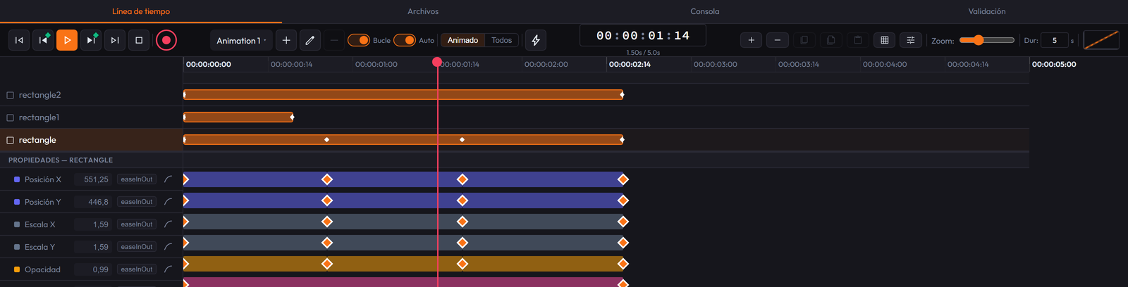
With many layers, the list on the left (names) and the tracks on the right (keyframes) scroll vertically together, within their fixed-height strip.
Several independent named animations
IHTML allows separate, independent timelines:
- The header selector shows the active animation; next to it are "+" (Add Animation) — which creates a new one and asks for a name —, the pencil (Rename), and the trash can (Delete). You can't delete the last one (the button stays disabled); deleting one loses its keyframes on every element and asks for confirmation.
- Loop and Auto belong to the selected animation: Loop starts over when it reaches the end (off, it stops on the last frame); Auto starts on its own when the exported page loads. A new animation doesn't start on its own: the point of having several is to trigger them with Play Timeline actions.
- Keyframes are tied ONLY to the active animation: the same property can have different keyframing in each animation.
- Switching animations refreshes the Timeline, the canvas, and the playhead.
Action markers on the Timeline
The lightning-bolt button (or double-click the thin band under the ruler) adds a marker at the playhead's position: it triggers an action when playback reaches that millisecond, without the visitor touching anything.
- It's edited in the same Inspector Actions panel (same types; the Trigger row disappears: the "when" is the marker's position).
- It's dragged to move it and removed with Delete from the same panel.
- Fires once per pass (with Loop, it fires again on every loop).
To keyframe a property
- Pick (or create) the animation you want to work on.
- Select an element and click the diamond (◆) next to the property you want to animate (position, opacity, color, scale...) to turn on keyframe tracking for that property.
-
Move to another point on the timeline (dragging the playhead) and change the value: a keyframe is
created automatically if Auto-Keyframe mode (red ◆ button, shortcut
R) is on; if not, use "Add Keyframe at Playhead". - Double-click a keyframe to cycle its easing curve (linear, ease-in/out, cubic, back, bounce, elastic...).
-
Spaceplays/pauses; the previous/next frame buttons step frame by frame; total duration is controlled in the Dur field (per animation).
Auto-recording (REC / Auto-Keyframe)
With R on, IHTML creates a keyframe at the playhead's time every time you change a
property already being tracked — this includes a vector's nodes and handles (dragging a point
or its bezier handle records the whole node). While REC is on, a blinking red badge ("● REC") shows
up top right.
Selecting, dragging, and copy/pasting keyframes
-
Clicking a keyframe selects it;
Shift+click adds/removes; a marquee over empty space selects every one it touches. - The flat bar between two consecutive keyframes is also selectable and draggable: it moves the whole segment while keeping the interval.
- Dragging near the playhead or another keyframe snaps exactly to that time (green guide).
-
Ctrl+C/Ctrl+Vcopy/paste the selected keyframe(s) at the playhead's time (besides the Copy/Paste/Duplicate buttons next to the easing selector); with several, their relative spacing is kept.
Timeline context menu (right-click)
- On a keyframe: Copy, Duplicate, Delete, Interpolation (a visual grid of curves), and Move to playhead.
- On the segment: Copy, Duplicate, Delete (applied to both ends as a group).
- On empty track space: Paste, at the time under the cursor.
- On an element's name: the same element menu as Layers and the canvas.
- On the ruler: "Extend +1s" adds a second to the total duration.
Files (connected to your real folder)
Next to the Timeline tab is Files: a manager connected DIRECTLY to a real folder on your computer, like Godot/Unreal/Unity's FileSystem panel. Choose folder asks for the system folder (once per session); clicking an image, video, or audio file in the tree adds it straight to the canvas as a new element. It uses the File System Access API: Chrome/Edge/Opera only for now — in Firefox or Safari the button appears disabled with a note.
4. Interactive actions (no code)
In the inspector's Actions tab you define what happens when the user interacts with an element in the exported HTML, without writing JavaScript:
- Triggers: click, hover, mouse enter/leave, double click, On Drag Start / On Drag End (a plain click with no movement doesn't count as a drag), key pressed, scroll, entering the viewport, after a delay, on page load.
- Actions: show/hide/toggle visibility, add/remove/toggle a CSS class, animate a CSS property, play / pause / go to a time of a specific named animation (the "Animation" field), scroll to an element, set an inline style, go to a Page.
- Target: the element itself, its parent container, all elements, or a specific element chosen by name (the Target selector lists, below the three fixed options, every element from Layers). Doesn't apply to Play/Pause/Go to Time, Set Variable, or Go to Page: those are global to the project.
Pages (scenes)
The Pages tab in the left sidebar lists the Artboards as navigable pages — it's not new data, just a dedicated view. Right-click: the same Activate/Rename/Duplicate/Delete menu as an artboard's background.
- "+ New page" opens a menu: Blank page or a responsive preset (Tablet vertical/horizontal, Mobile vertical/horizontal).
- A Tablet/Mobile preset created with another page selected gets grouped as a responsive variant of that page (indented in Pages and Layers). A blank page is never nested. Duplicating a variant keeps the parent page; deleting a page with variants promotes them to root.
- By default only the selected page is shown (and only its layers in Layers). The "Selected only" / "All visible" button switches both views: with "All visible", the other pages show up on the canvas as an empty rectangle (position/size, movable, resizable, activatable with a click) without their real content.
- The Go to Page action hides the current page and shows another one with a transition: Fade, Slide (4 directions), or instant (None), with its duration in ms. In the exported HTML, only if the project uses Go to Page somewhere are ALL pages bundled together (hidden except the initial one) — a project with several artboards that doesn't use Go to Page exports exactly the same as always.
Project variables (counters and math)
Above the actions list: Project Variables — named numeric values for the whole project. Useful for counters, scores, form steps, etc.
- Create the variable with "+ Add Variable" (name + initial value; the name gets reduced to letters, numbers, and underscores, and can't break the syntax).
-
Modify it with Set Variable (math): which variable, which operation
(
= Set to,+ Add,− Subtract,× Multiply by,÷ Divide by,% Remainder of,⌃ Clamp min,⌄ Clamp max) and with what number. Dividing by zero leaves the value unchanged. -
Show it by typing
{{name}}in any element's Content field: you see the current value on the canvas and in the exported page, and it updates on its own. A name that doesn't match any variable is left visible as-is, so the error is noticeable.
A full counter: variable score = 0, a button with
click → Set Variable → score → + Add → 1, and a text Score: {{score}}. If no
action modifies a variable, its value gets baked into the exported HTML with no line of JavaScript.
Elements showing a variable repaint live only if they have no nested children.
Physics (real simulation — gravity, collisions, bounce)
The Inspector's Physics tab gives any element real physical behavior, powered by the Matter.js engine:
- Enable physics: turns on the simulation for that element.
- Body type: Dynamic (falls, bounces, collides with other bodies and the canvas edges) or Static (fixed — useful as ground, a wall, or a platform).
- Shape: Rectangle or Circle (the collision shape, not the visual look).
- Bounce, Friction, and Density: bounciness, slipperiness, and weight.
- Bodies stay enclosed within their page/artboard: the four edges act as invisible walls.
- A Dynamic body can be grabbed and dragged on the exported page or in Preview; on release it keeps the real physics going. A Static one won't move even if you "grab" it.
- Important: physics doesn't simulate live while you edit (the element shows at its X/Y position, so it doesn't compete with dragging); it starts in Preview or when the exported HTML opens. A project with no Physics doesn't download any extra library.
5. Custom code
Two code buttons in the top bar, with different scopes:
- 💻 Code Editor — CSS/JS for the selected element: CSS that gets added inline to the element, or a script that runs when it's clicked in the exported HTML.
-
`</>` Live HTML/CSS — a live, editable view of the HTML and CSS for the
whole project: you write and tap "Apply Changes" to push it into the project.
-
A tag with an existing
idupdates that element (content, attributes, classes, parent). -
A new tag needs
data-type="..."to be created as a real element; without it, it's ignored with a warning. - Deleting a tag deletes that element.
- Styles you delete from the CSS don't get removed from the element on their own — use that section's reset button in the Inspector.
- A hand-written gradient/filter/transform that doesn't match the exact format the panel generates gets ignored (this isn't a full CSS parser, it's a round-trip view of the data model).
- "Refresh" discards any unapplied change.
-
A tag with an existing
6. Export
There are two paths: Export HTML to publish on the web, and Export
(.ihtml) to send a document that opens with IHTML Mirror.
-
🌐 Export HTML — for the web (hosting, CMS,
<iframe>...): a dialog with Single HTML file (a single, standard, self-contained.htmlfile, with the engine embedded, with NO project data — lighter) or Separate HTML + CSS + JS. This.htmlworks in any browser and hosting. -
💾 Export — downloads
project.ihtml: IHTML's document. It carries the WHOLE project embedded (elements, animations, keyframes, actions, layers, fonts, images, video). It's both the result and the source: whoever receives it opens it with IHTML Mirror (the free app, desktop or Android) and you reopen it with Import to keep editing exactly where you left off. An.ihtmlfile is not meant to be double-clicked in Chrome: Mirror opens it, since it understands the format. If you need it to show in a browser with nothing installed, use Export HTML. - ▶ Preview — opens the result in a new tab with nothing downloaded, taken from the editor's current state.
- 🖼 Export image / GIF / video — rasterizes the artboard: a still image (PNG, WebP, JPEG), an animated GIF, or a video (MP4, WebM). You pick FPS and scale.
- 📱 Mobile preview — shows a QR code; scan it with your phone to see the project live (same network, reloads on its own as you edit).
.html and .ihtml export, GIF and video, Preview, and the QR
mobile preview. Enabled with a license key in Settings › Plan.
Both are independent of the editor: they only carry a minimal runtime generated from the same animation engine, so the result animates exactly like the preview.
.ihtml file: from IHTML Mirror ("Open project" button, or by dragging
it onto the window). On Android, when you receive the file (say, over WhatsApp) pick IHTML
Mirror in "Open with". In the Editor, Import opens it for editing.
7. Import
📂 Import accepts both .ihtml (it auto-detects the embedded project) and a
.json exported by older editor versions (backward compatibility). If the file doesn't
have the expected shape (missing elements, or it's not a valid JSON/.ihtml
file), the editor rejects it with a message explaining what's wrong, without touching the project you
had open.
IHTML can also rebuild a design from other formats and bring it in as editable elements on a new artboard:
-
Real HTML (right-click an
.htmlfile in the File Manager): it's measured with an iframe and every node gets converted to its IHTML element, keeping hierarchy and styles. - SVG (shapes, text, and images) — the recommended path to bring in a Figma frame (export it as SVG).
-
Designs from Sketch (
.sketch), Penpot (.penpot), and EPUB books.
8. Project format (embedded in .ihtml, or the old .json)
Quick reference for the structure:
// project: name, version, artboards[], animations[], grid, classes
{
  "project": { "name": "My Project", "artboards": [ ... ], "animations": [ ... ], ... },
  "activeArtboardId": "artboard-1",
  "activeAnimationId": "anim-1",
  "elements": [
    {
      "id": "elem-172...-a1b2c", "type": "text",
      "parentId": null, "artboardId": "artboard-1",
      "styles": { "left": 100, "top": 50, "width": 300, ... },
      "keyframes": { "anim-1": { "opacity": [
        { "time": 0, "value": 0, "easing": "linear" },
        { "time": 1000, "value": 1, "easing": "easeOutCubic" } ] } },
      "actions": [ { "trigger": "click", "type": "toggleClass", ... } ]
    }
  ]
}
All numeric values in styles/keyframes go without a unit
(left: 100, not "100px"); the editor adds px/deg/
etc. On import, the editor normalizes values with units and migrates old projects (single artboard,
flat animations) automatically.
9. Keyboard shortcuts
| Shortcut | Action |
|---|---|
V / H / T / S / P / Z
|
Tool: Select / Hand / Text / Shape / Pen / Zoom |
Space |
Play / pause |
← → ↑ ↓ |
With a selection: move the element(s) 1px (respecting their own axis if inside a rotated
parent). With no selection: moves the active artboard; ←/→ also
step the timeline back/forward one frame
|
Shift + arrow |
Move element(s) or artboard 10px instead of 1px |
Ctrl + drag |
Snap to grid (instead of smart snapping) |
Home / End |
Go to the start / end of the timeline |
Ctrl+D |
Duplicate selection |
Ctrl+C / Ctrl+X / Ctrl+V |
Copy / cut / paste selection. With keyframes selected on the Timeline, copies/pastes THOSE keyframes instead (takes priority) |
Delete / Backspace |
Delete selection (with no selection, deletes the active artboard — never the last one) |
Ctrl+Z / Ctrl+Shift+Z (or Ctrl+Y) |
Undo / redo |
Ctrl+A |
Select every element on the canvas (inside a text field, selects that field's text instead) |
R |
Toggle Auto-Keyframe mode |
Ctrl + mouse wheel |
Zoom the canvas |
| Right-click | Context menu (element, artboard background, or Elements panel card) |
In Layers: Ctrl/Cmd+click, Shift+click |
Multi-select (add/remove one item, or a range) |
10. Public runtime API
When the project has any animation or action, the exported HTML/.ihtml exposes
window.ihtmlDocument — a public, stable, documented API to control it from OUTSIDE the
no-code itself (your own script, a page that embeds it, or browser automation):
ihtmlDocument.playTimeline('Bounce'); // plays that named animation
ihtmlDocument.pauseTimeline('Bounce');
ihtmlDocument.gotoTimeInTimeline(500, 'Bounce'); // ms, name
ihtmlDocument.isTimelinePlaying('Bounce'); // true/false
ihtmlDocument.timelineNames(); // ['Animation 1', 'Bounce', ...]
ihtmlDocument.getElementById('elem-172...'); // the real DOM node
ihtmlDocument.triggerAction('elem-172...', 'click'); // fires its "click" actions
ihtmlDocument.triggerAction('elem-172...', 'keydown', 'Escape');

ihtmlDocument.getVariable('score'); // current value
ihtmlDocument.setVariable('score', 10); // changes it and repaints {{score}}
ihtmlDocument.variableNames(); // ['score', ...]
Names are the ones you set in the editor (the Timeline's selector, the Project Variables panel), not internal ids.
Embedded via a same-origin <iframe> (the embedding page and the exported
file are served from the same domain):
const win = document.getElementById('myIframe').contentWindow;
win.ihtmlDocument.playTimeline('Bounce');
postMessage, not implemented yet.
11. MCP — control by AI agents
IHTML exposes an MCP server (Model Context Protocol) that gives an AI agent — Claude Code or another MCP client — direct control over the already-open editor (the browser in development, or the desktop app), without simulating mouse clicks against a window: the same pattern already used by editors like Godot or Blender.
To enable it, an .mcp.json file at the project root points to the server:
{
  "mcpServers": {
    "ihtml-editor": { "command": "node", "args": ["bridge/mcp-server.js"] }
  }
}
With the editor open (browser or desktop app), the agent can already call tools like:
get_scene— reads the active artboard and every element.-
add_element/set_text/set_style/delete_element— creates and edits elements (set_styleaccepts a breakpoint to write a responsive override instead of the base value). -
set_breakpoint/select_element— changes the active breakpoint or the selection, just like a real click. -
set_canvas_size/fit_canvas_height— resizes the artboard (its own height per breakpoint) or fits it to the real content. apply_template— loads a template from the catalog.-
get_html— returns the HTML/CSS/JS the project would export, without writing any file.